GOOGLE (CONTRACT) * 2026
Exploring google offices around the world
ROLE
Product Designer
TIMELINE
Jan 2026 - May 2026
TEAM
Product designers,
UX Researchers
Developers
Project management

OVERVIEW
Context: Our Client
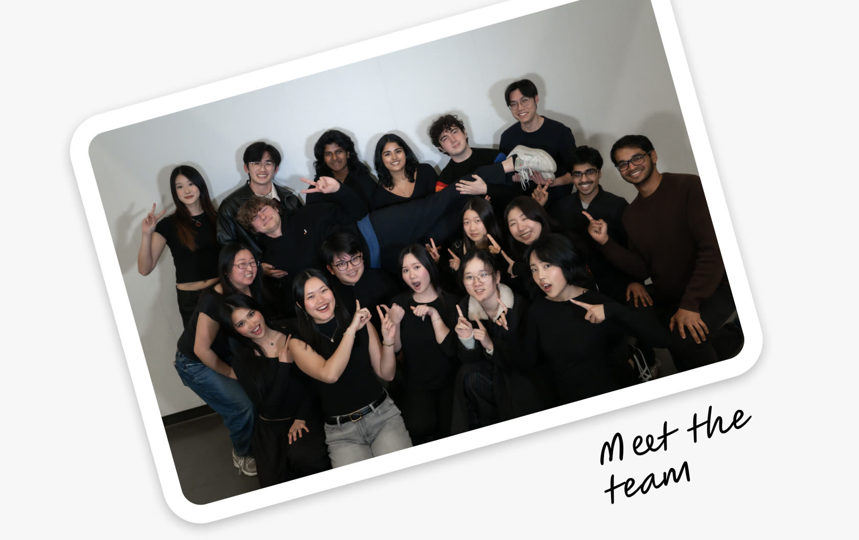
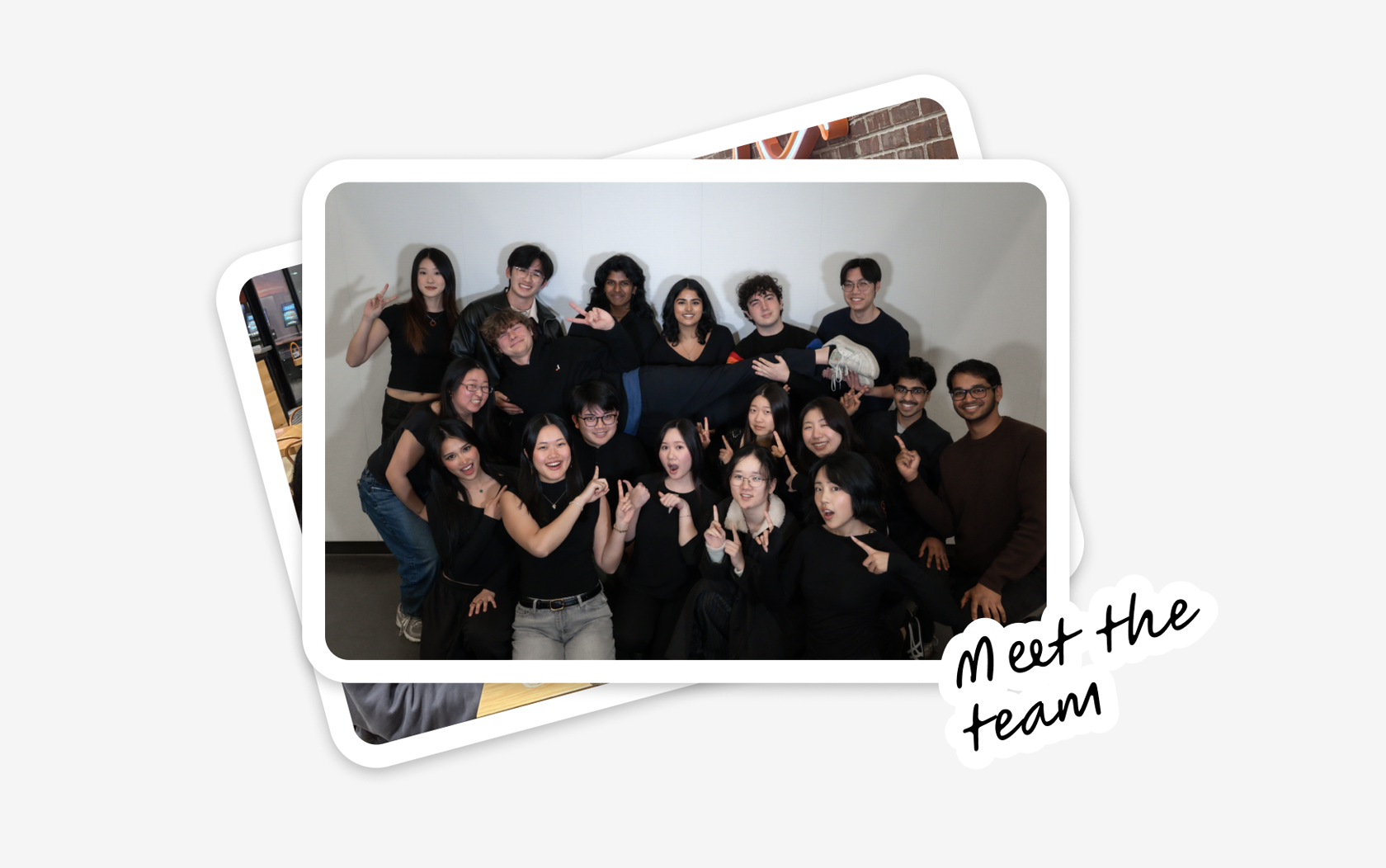
Meet the designers, devs, and project managers for the project
This project involved a team of eight total designers, four specialized for user research and four for user interface, one of which was me. My role as a product designer was to own the design of my own page for use of individual office locations, and design components that would be evaluated for the final aggregate designs.
MY IMPACT
My contribution to the project
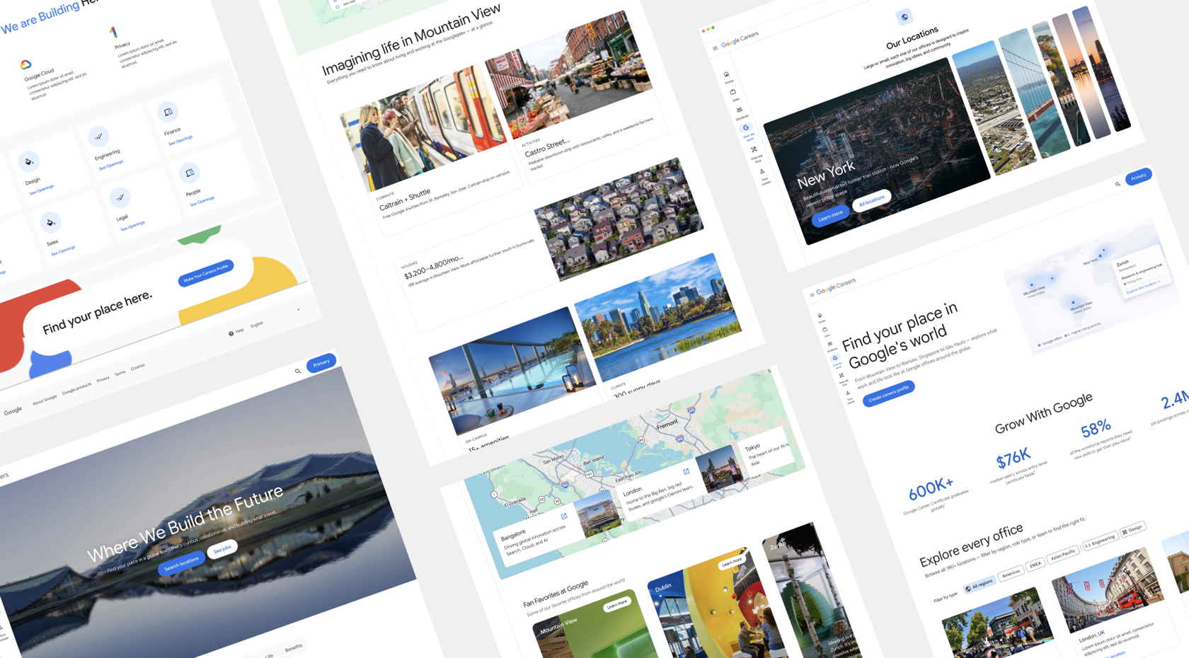
- Authored and designed 2 novel components that made it to the final client handoff
- Utilized findings from over 150+ user insights to curate and perfect component designs to drive user engagement
- Designed responsive templates for lower traffic locations out of Google’s offices
PROBLEM
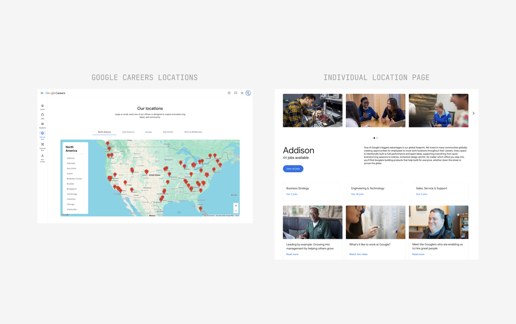
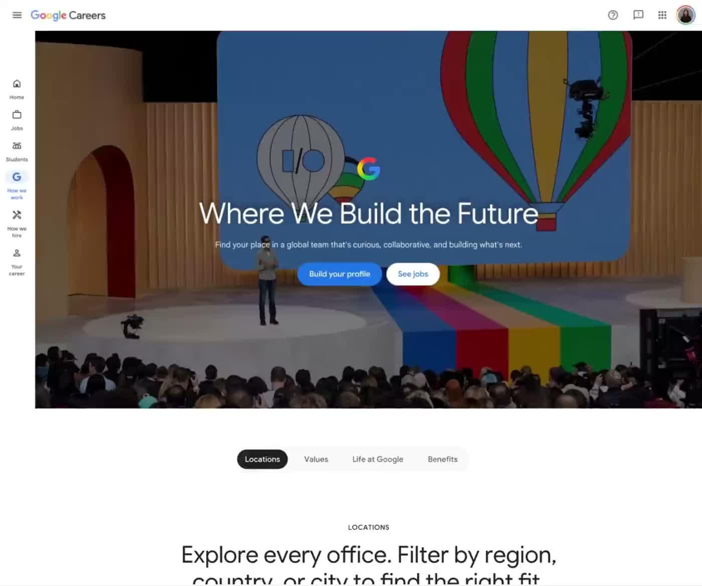
What’s shown above encapsulates the entire experience for navigating Google’s offices around the world
The existing locations workflow operated as such: the user would use a main landing page to navigate to a specific location page, which were often bare and reused the same template across locations of all degrees of traffic.
- Higher traffic locations: Mountain View HQ, New York, etc
- Low traffic location (scarce media coverage): Thornton
In sum, the existing user flow and designs yielded low conversion from interest into applications.
The problem statement:
How could we redesign the locations experience to thrill users to apply to offices of choice?
SOLUTION
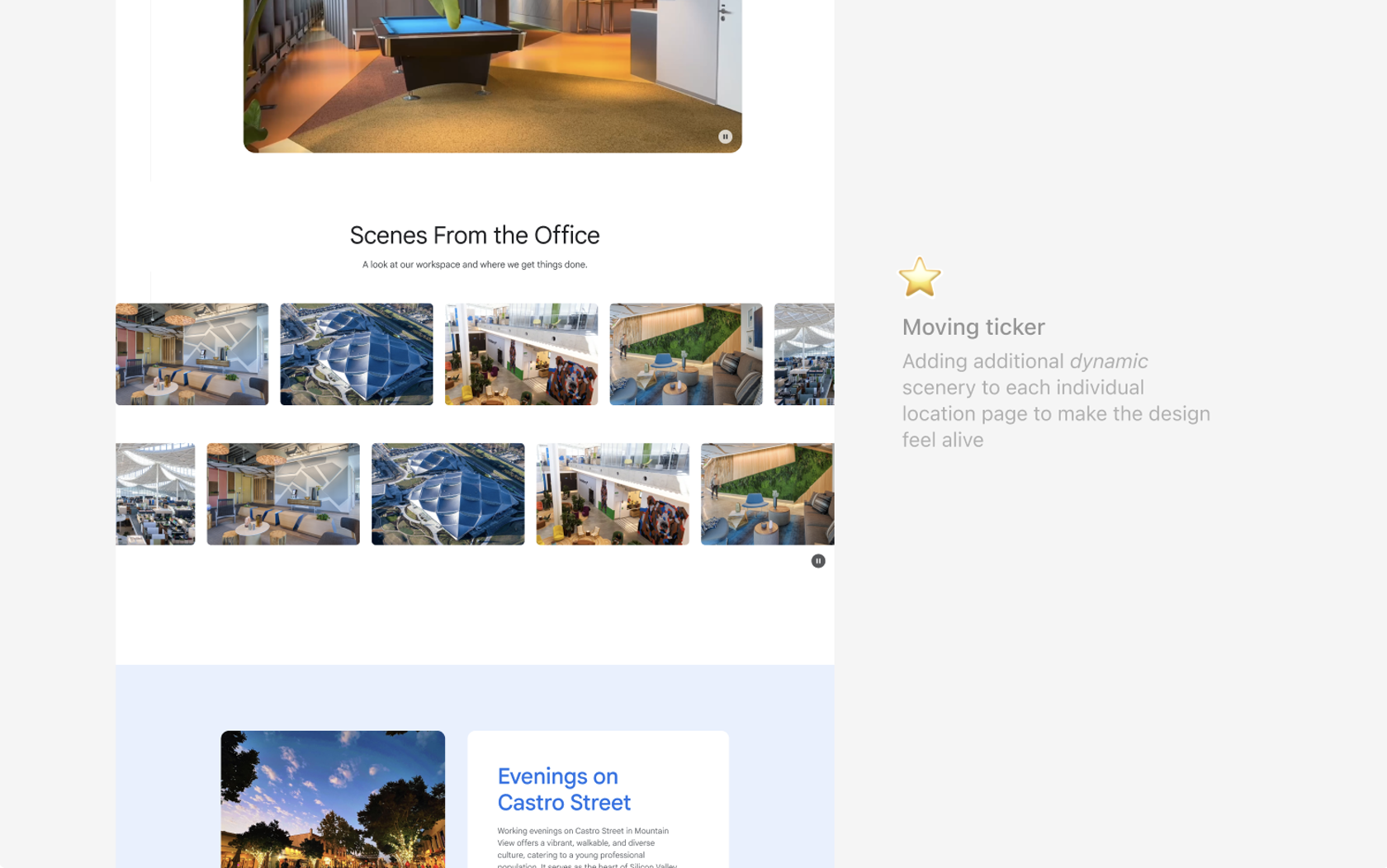
Pages with moving, interactive components that told real stories about each location
SOLUTION
Templates for featured locations and low traffic locations
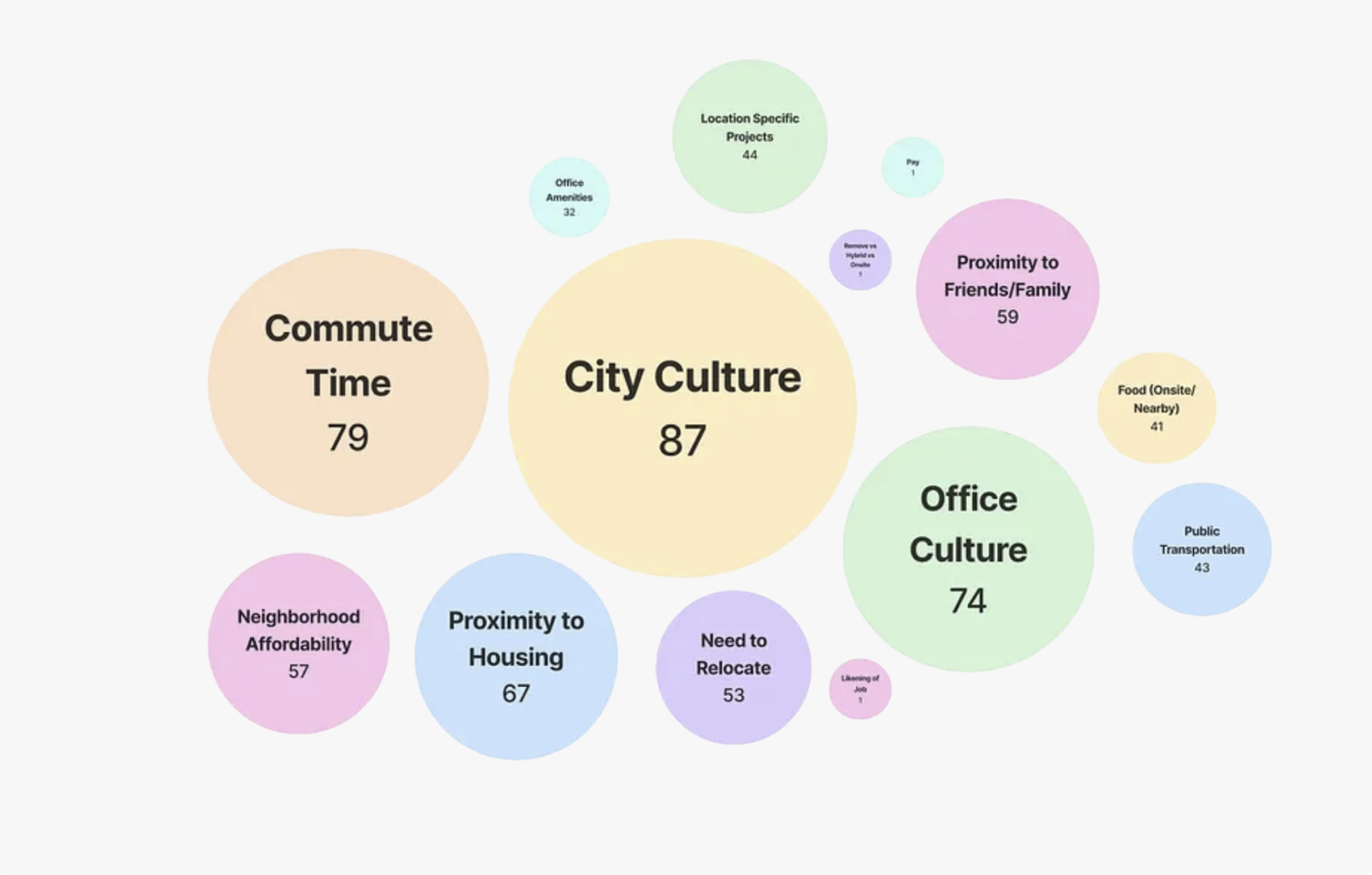
USER RESEARCH
Regulatory teams have to consolidate a bulk of legislative infomration
Competitive analysis: primary findings
Widget 1
Widget 1
Widget 1
USER RESEARCH
Competitive analysis cont.
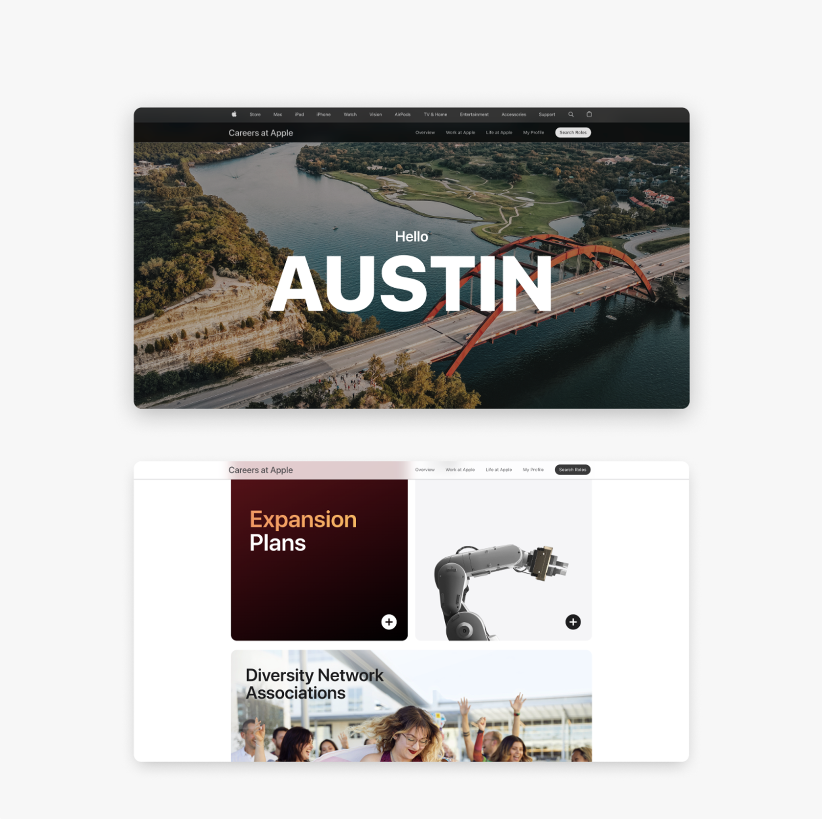
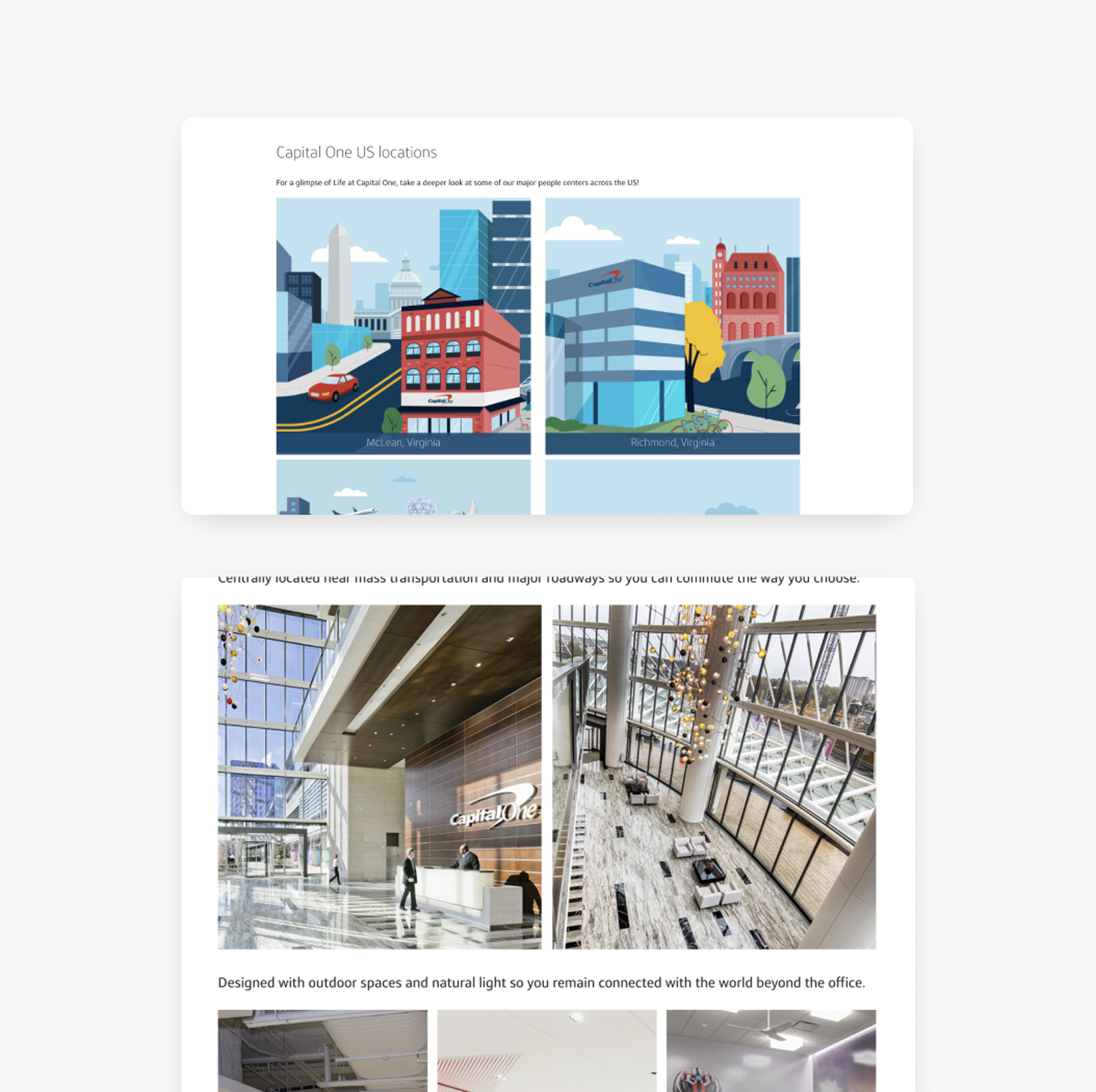
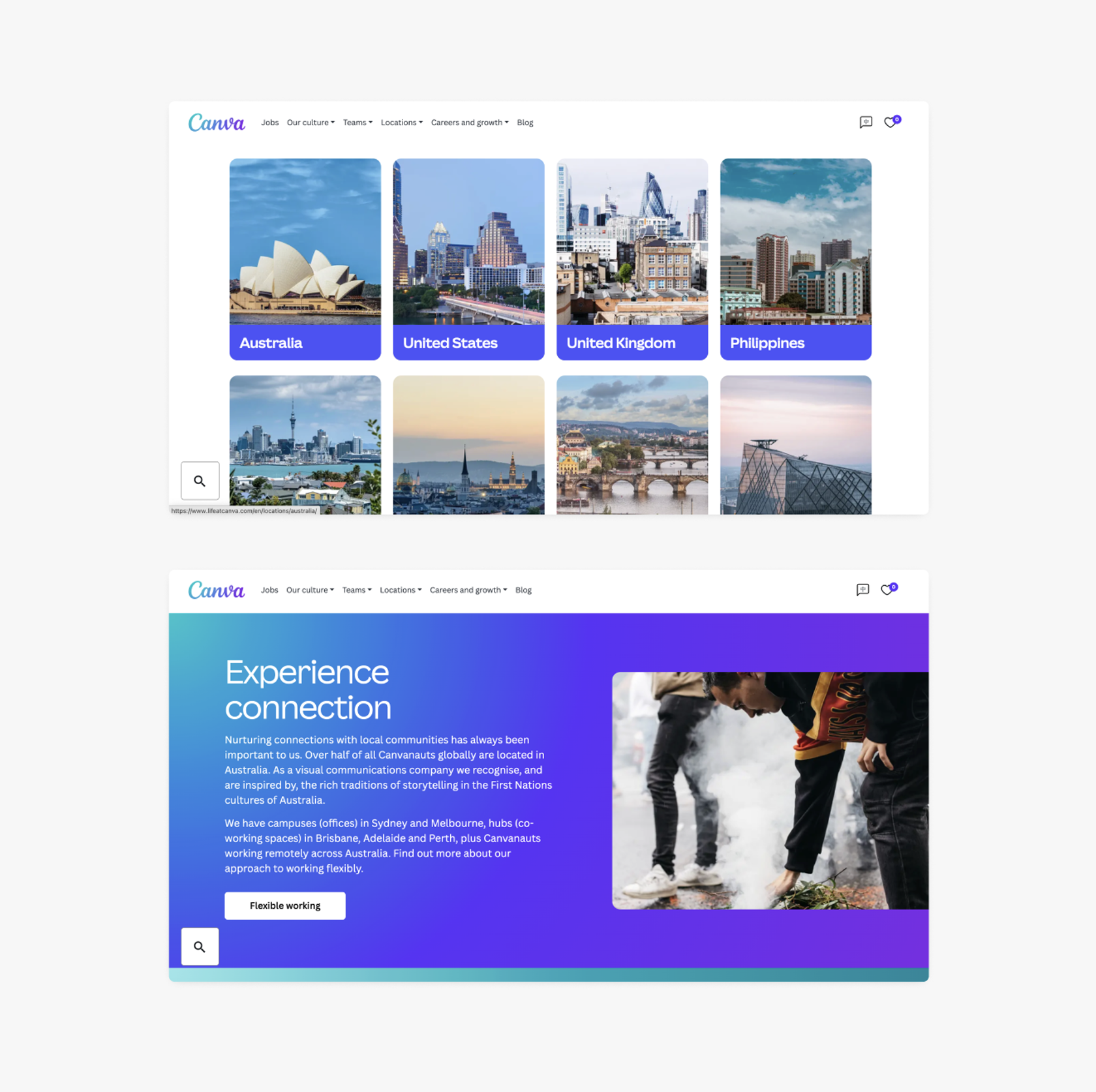
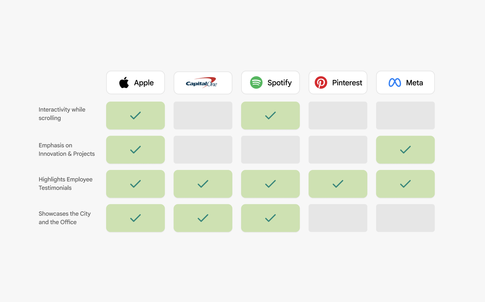
Our product design team conducted competitive analysis to evaluate how other companies achieved a sense of story telling through their landing interfaces.
We found that almost all companies we analyzed employed employee testimonials but the strongest of the bunch, Apple, simply had the strongest component design, which is the approach that I wanted to aim for.
DESIGN PROCESS
The Brightspot Design System
Brightspot is one of Google’s design systems for their marketing interfaces. Working with this system, we were given an 80/20 constraint: 80% of the components we used had to stay true to Brightspot native components, and only 20% could be novel to the given system.
My Approach
Given this constraint, my approach was to design as many components by hand as I could think of, I’ve included the key trials and errors throughout my designs below.
COMPONENTS: TRIAL AND ERROR
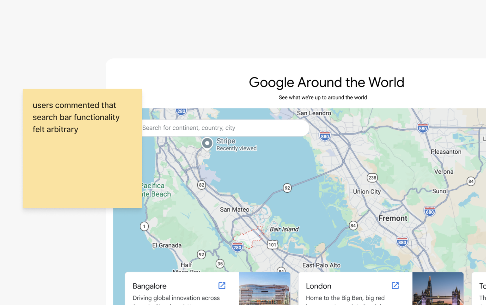
A map component in the landing page
Goal: give users familiar interactions to explore locations world wide, promoting ease of use, with a featured locations carousel
COMPONENTS: TRIAL AND ERROR
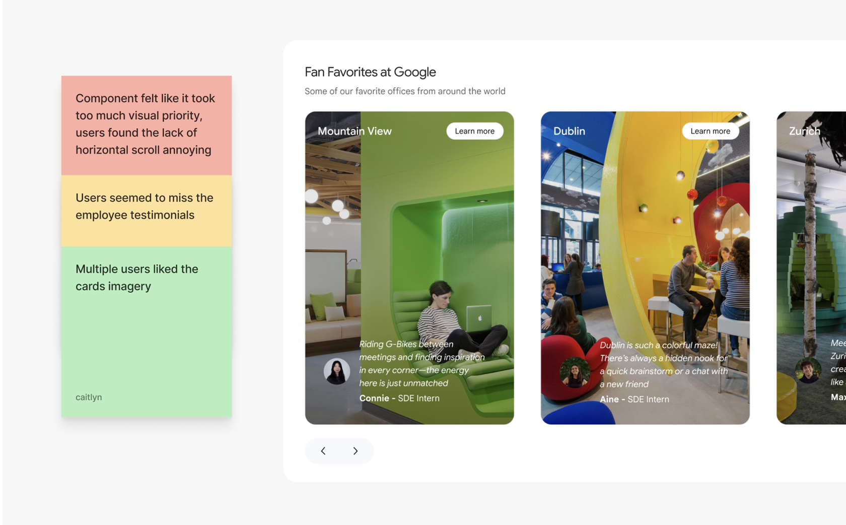
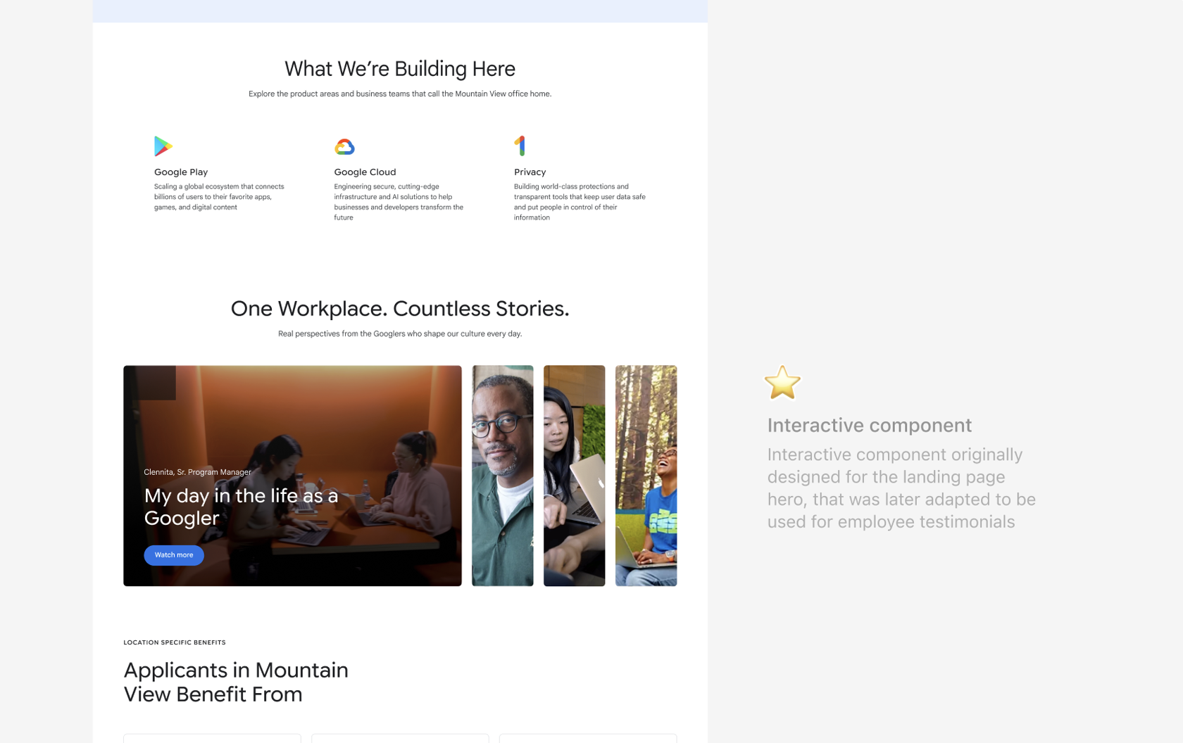
Employee testimonial carousel
Goal: vertical rectangle cards modeled after carousel in one of Google’s existing interfaces (Deep Mind), received relatively well by users with concerns on usability.
COMPONENTS: TRIAL AND ERROR
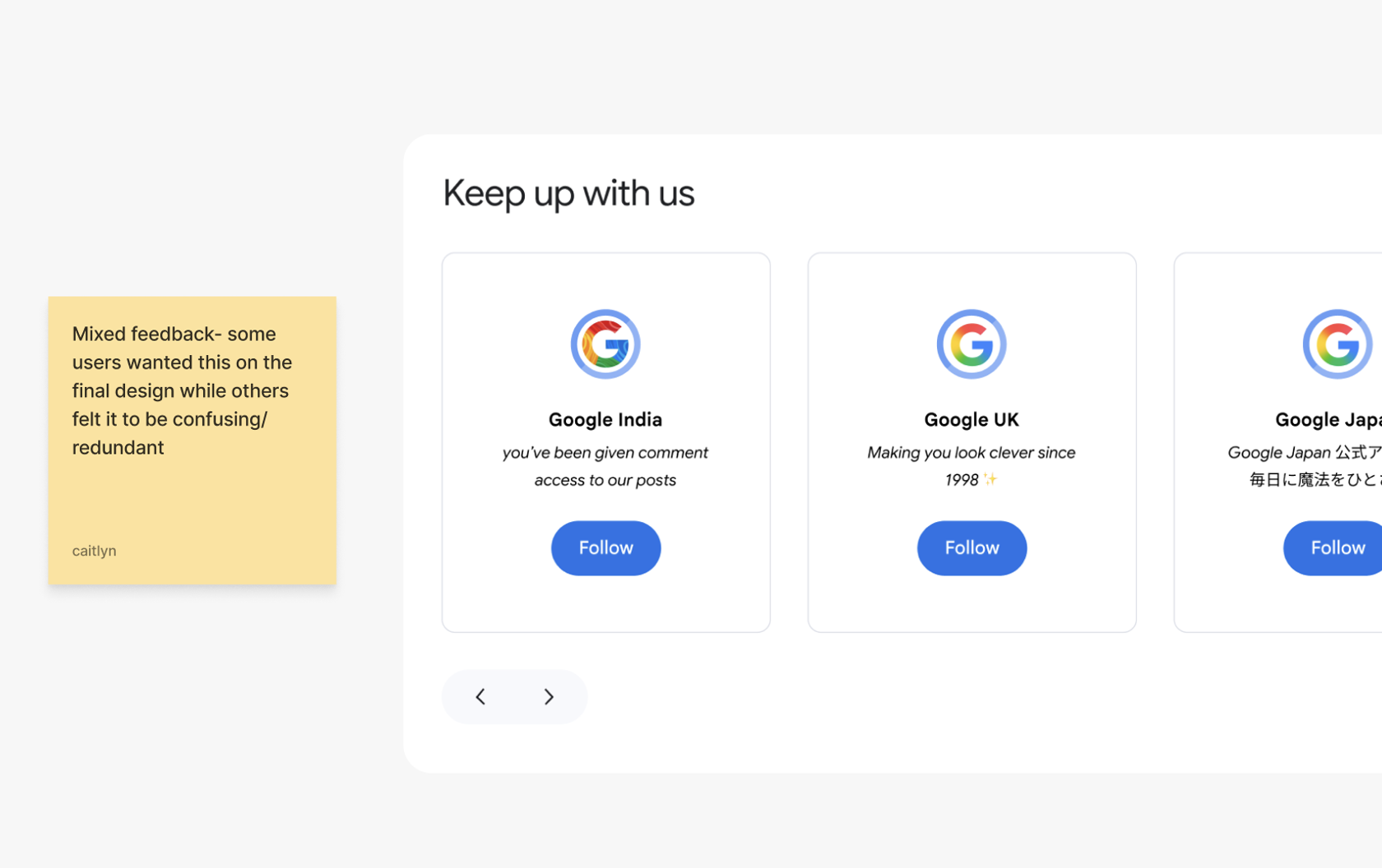
Google’s socials around the world carousel
COMPONENTS: TRIAL AND ERROR
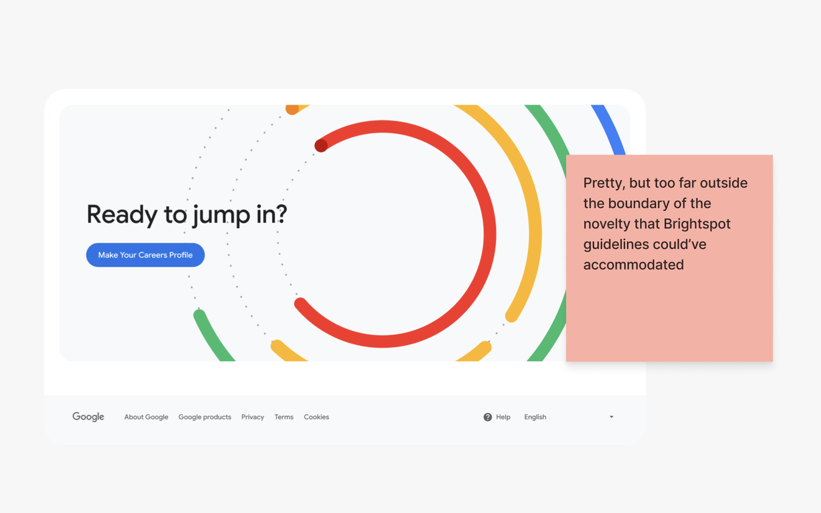
A graphic to go with the CTA at the bottom of the landing page
Both user interviews and designers on the team agreed with the usage of this CTA, but was ultimately scrapped because it stepped too far beyond the boundary of our design constraints.
COMPONENTS: TRIAL AND ERROR
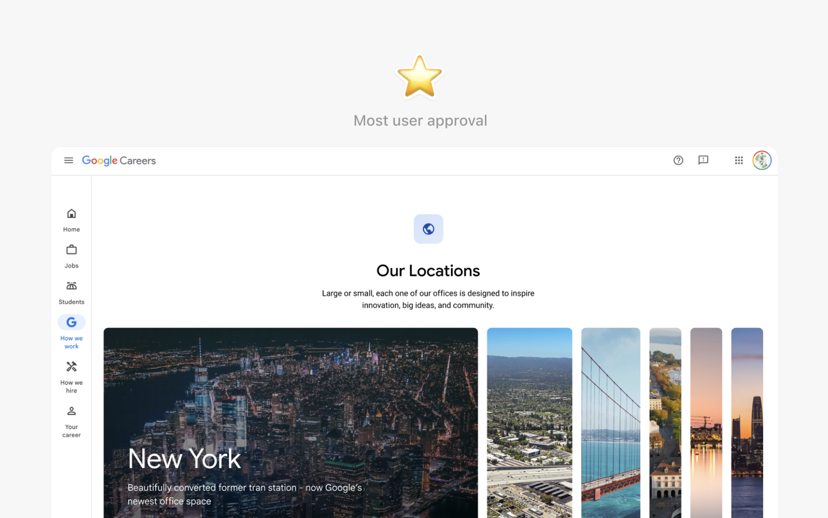
Slider component for featured locations
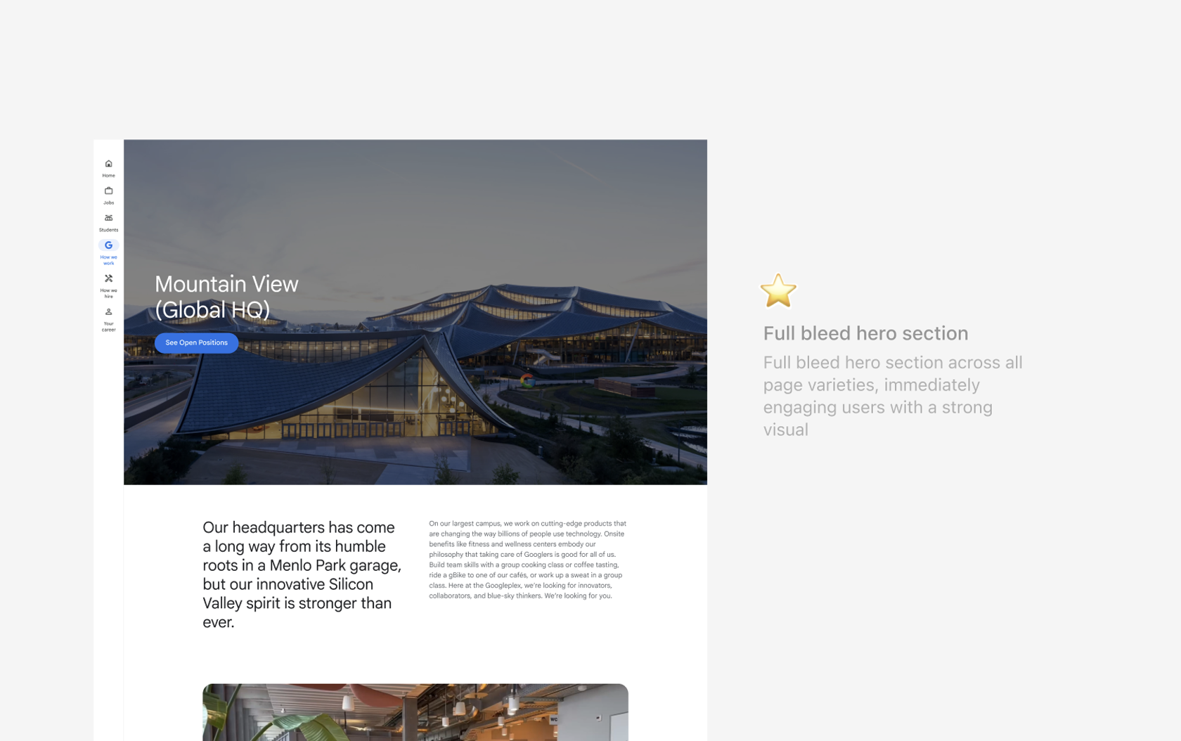
A slider component that would reveal featured locations on the main landing page, which users expressed to be engaging and eye-catching. Ultimately however we utilized this slider for member testimonials, adhering to a full bleed hero throughout all handoffs for cohesion across landing pages.
Final Designs
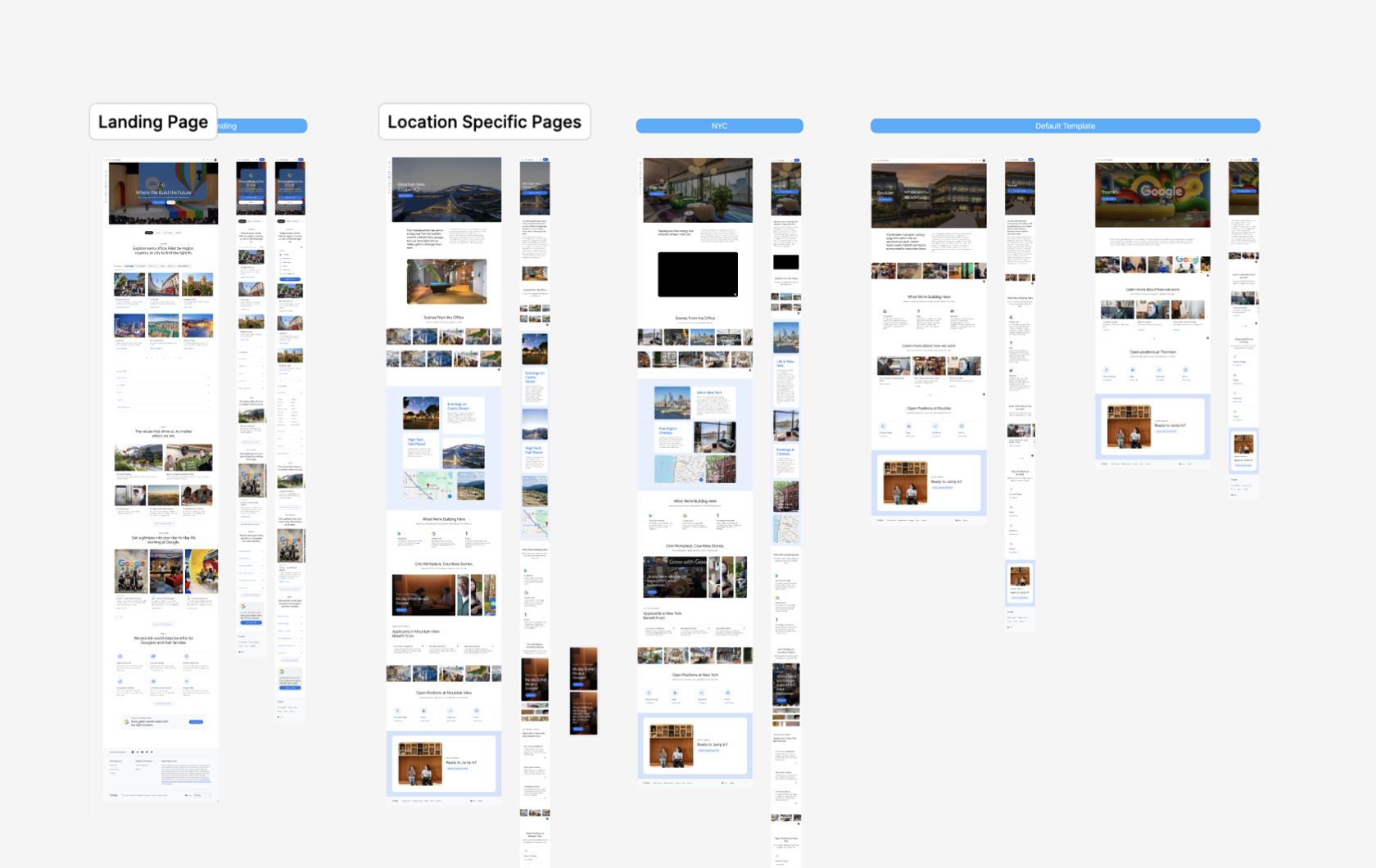
FINAL DESIGNS
4 responsive templates for individual locations pages + 1 locations landing page
OUTCOMES
What we found comparing user sentiments from initial surveying on the original locations page throughout 140+ user surveys and our redesigns in 7 user acceptance tests.
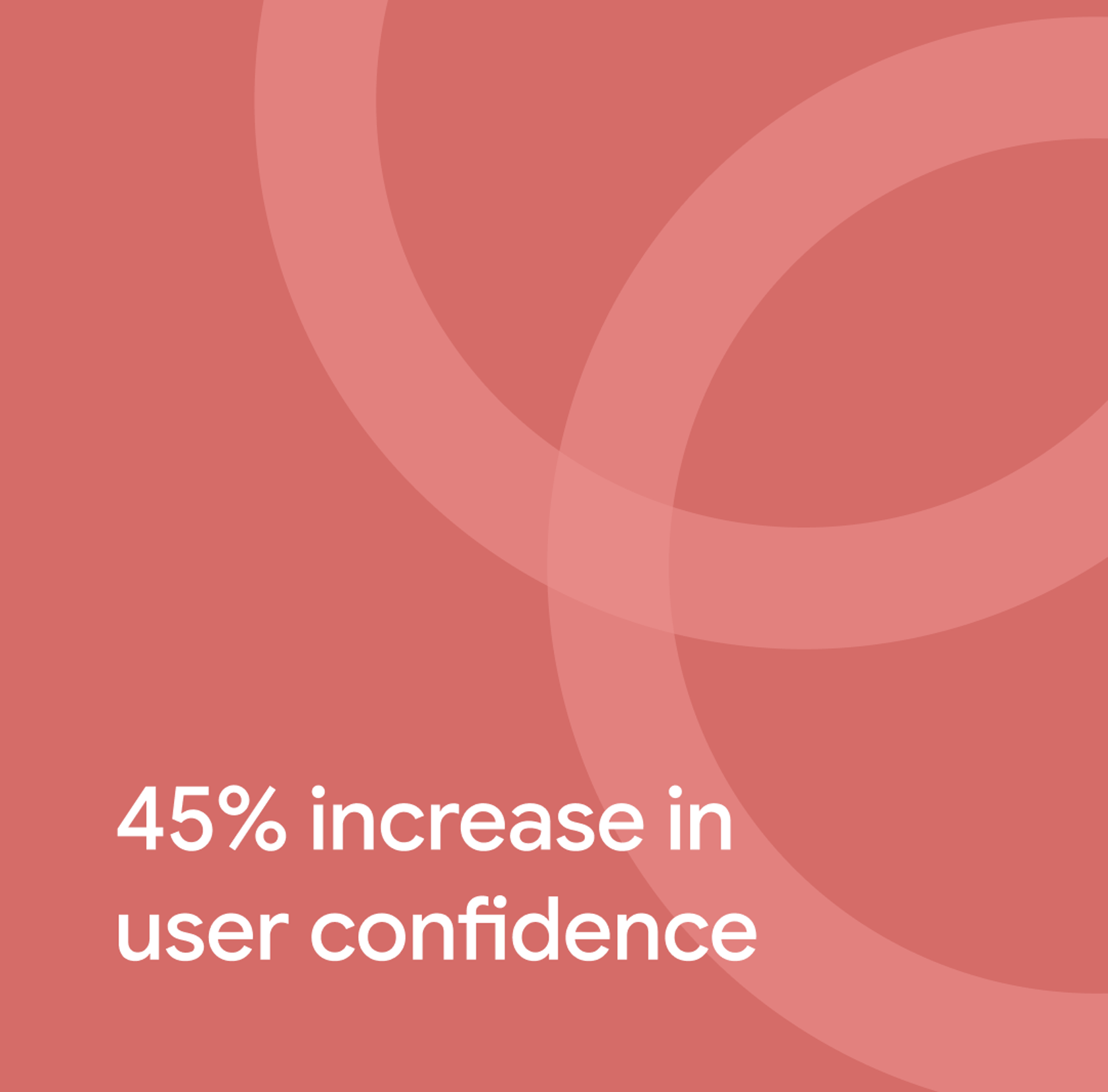
Increased user confidence by a significant margin
User acceptance interviews yielded a much higher average degree of confidence in prospective applicants than in initial surveys (3.8/7 → 5.5/7)
The visuals work
Authentic, people-forward imagery, employee stories, workplace photos, the testimonials slider consistently outperformed corporate stock photography in driving engagement
Enhanced storytelling
Location browsing and workplace stories held the longest engagement time on the page, reversing the flat, disengaged pattern seen on the original design (7 UAT sessions).
REFLECTION
Making decisions from client constraints and user research
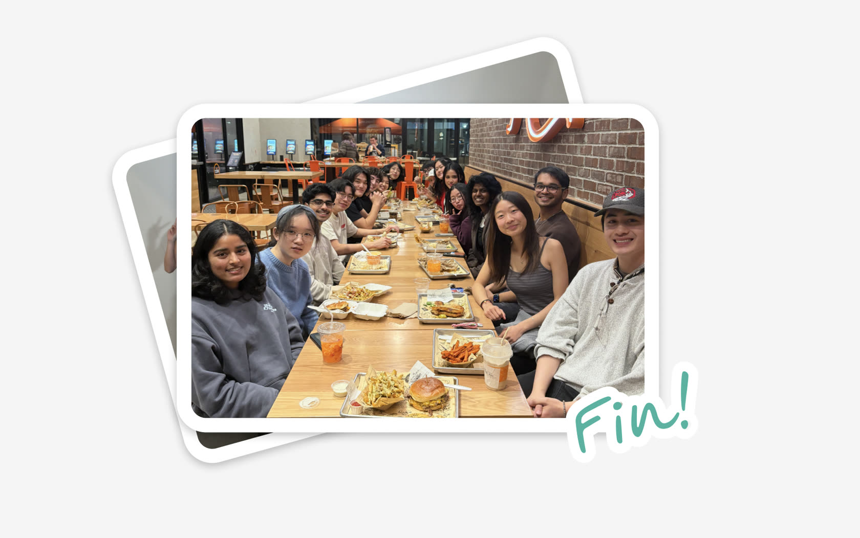
Thank you to Amy, Mary, and TC on the Integrated Marketing Team for the Wednesday sync and guidance throughout the course of the project <3